Your VTuber overlay is not decoration.
It is a branding system, user interface, and conversion tool.
A well-designed VTuber overlay:
- Improves viewer retention
- Strengthens brand identity
- Increases perceived professionalism
- Makes sponsors trust you faster
- Helps your channel stand out instantly
A bad overlay does the opposite:
- Distracts viewers
- Hides your model
- Breaks immersion
- Makes streams look amateur
This complete guide shows you how to design VTuber overlays that look professional, match your brand, and perform well on Twitch and YouTube.
If you are still defining your identity, start here:
👉 vtuber brand identity
Why VTuber Overlay Design Matters More Than You Think
Overlays affect:
- Viewer first impression (within 3 seconds)
- Model visibility
- Chat readability
- Sponsor placement
- Brand memorability
Streams with clean overlays show:
- Higher watch time
- Lower bounce rate
- Stronger emotional connection
Your overlay is part of your visual storytelling system.
Related branding foundation:
👉 vtuber branding guide
👉 vtuber debut planning guide
The 8 Core Principles of High-Quality VTuber Overlay Design
Before designing anything, follow these rules.
Principle 1: Your VTuber Model Must Always Be the Focus
Your overlay must frame your model, not compete with it.
Avoid:
- Thick borders around model
- Bright colors near face
- Animated elements overlapping expressions
Good overlays:
- Leave breathing space
- Keep face area clean
- Highlight eyes and mouth
This improves:
- Tracking visibility
- Viewer connection
- Emotional impact
Related setup:
👉 vtuber lighting setup
Principle 2: Overlay Supports Branding, Not Decoration
Your overlay should reflect:
- Personality
- Lore
- Color palette
- Genre
Cute VTuber:
- Rounded shapes
- Pastel colors
Cyber VTuber:
- Sharp lines
- Neon accents
Elegant VTuber:
- Thin frames
- Soft gradients
Your overlay is a brand extension, not random art.
Principle 3: Minimalism Beats Complexity
Professional overlays use:
- Fewer colors
- Fewer animations
- Clear hierarchy
Avoid:
- Overanimated borders
- Flashing alerts
- Busy patterns
Simplicity improves:
- Viewer focus
- Stream readability
- Long-session comfort
Principle 4: Optimize for Viewer Eye Flow
Your layout should guide the eyes:
- Face
- Gameplay / Content
- Chat
- Alerts
Good flow reduces:
- Visual fatigue
- Missed expressions
- Cognitive overload
Principle 5: Overlay Must Adapt to Content Types
You need multiple layouts:
- Gameplay
- Chatting
- Singing
- Just Chatting
- ASMR
Static overlays hurt:
- Flexibility
- Branding consistency
- Production quality
Professional VTubers use overlay sets, not single layouts.
Principle 6: Chat & Alerts Must Be Readable
Bad overlays hide:
- Chat messages
- Donation alerts
- Sub notifications
Rules:
- High contrast text
- Soft background panels
- Avoid overlapping model
This improves:
- Viewer engagement
- Chat participation
- Alert recognition
Principle 7: Overlay Must Match Your Color Identity
Use:
- 1 primary color
- 1 secondary color
- 1 accent color
Avoid:
- Rainbow palettes
- Random gradients
- Unmatched UI elements
Related branding:
👉 vtuber brand identity
Principle 8: Performance-Friendly Design
Heavy overlays cause:
- OBS lag
- Dropped frames
- Encoding overload
Avoid:
- Large video loops
- Transparent 4K animations
- Uncompressed PNG sequences
Related performance:
👉 vtuber obs dropped frames fix
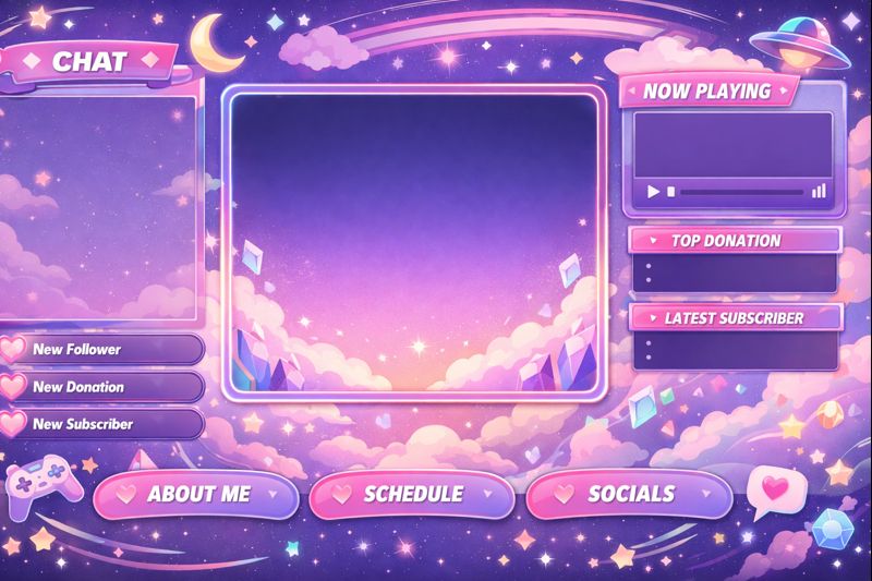
Essential VTuber Overlay Components (Professional Layout)
A complete overlay set includes:
1. Main Frame Layout
This defines:
- Model position
- Content area
- Safe zones
Best positions:
- Bottom left or right for model
- Center focus for gameplay
2. Face Cam / Model Frame
For VTubers, this replaces webcam frames.
Design rules:
- Thin borders
- Transparent background
- Rounded corners (for cute styles)
- Sharp edges (for cyber styles)
Never crop:
- Eyes
- Mouth
- Head tilt range
3. Chat Box Design
Chat should be:
- Clearly readable
- Soft background
- Non-intrusive
Best placement:
- Opposite side of model
- Vertical layout
4. Alert Box Design
Used for:
- Subs
- Donations
- Raids
- Follows
Rules:
- Appear near model
- Not block face
- Short animations only
5. Starting / Ending / BRB Screens
Professional streams always include:
- Starting Soon
- Be Right Back
- Stream Ending
These screens:
- Build hype
- Reduce dead time
- Strengthen brand recall
VTuber Overlay Styles (Choose Your Visual Identity)
Cute Overlay Style
Best for:
- Idol VTubers
- Cozy streams
Features:
- Rounded panels
- Pastel colors
- Soft borders
- Subtle animations
Cyber / Tech Overlay Style
Best for:
- FPS
- Tech VTubers
Features:
- Neon accents
- HUD-style panels
- Thin lines
- Motion UI
Fantasy / Lore Overlay Style
Best for:
- Story VTubers
- Roleplay
Features:
- Decorative frames
- Magical symbols
- Soft glows
Minimal Overlay Style
Best for:
- Singing
- ASMR
- Professional streams
Features:
- Clean lines
- Almost invisible frames
- Focus on model
Overlay Design for Live2D vs 3D VTubers
Live2D Overlay Design Tips
Live2D models:
- Need vertical space
- Sensitive to cropping
- Expressive faces
Overlay rules:
- Leave head movement margin
- Avoid top borders
- Keep mouth area clear
Related:
👉 live2d vtuber model optimization tips
3D VTuber Overlay Design Tips
3D models:
- Use more body movement
- Larger motion range
Overlay rules:
- Wider safe zones
- Transparent lower thirds
- Avoid blocking arms
Related:
👉 3d vtuber model performance optimization
Best Resolution & Format for VTuber Overlays
Recommended Sizes
- Canvas: 1920 × 1080
- Model area: flexible
- Chat box: 300–450 px width
Best Formats
- Static: PNG (transparent)
- Animated: WebM or MOV (alpha)
Avoid:
- GIF (poor quality)
- MP4 without alpha
OBS Setup for VTuber Overlays
Correct layering order:
- Background
- Gameplay / Content
- Overlay frame
- VTuber model
- Chat
- Alerts
Tips:
- Lock layers
- Use transform bounds
- Disable unnecessary filters
Related setup:
👉 vtuber obs sync issue
👉 vtuber stream stuttering fix
Free vs Paid VTuber Overlays
Free Overlays
Pros:
- Budget friendly
- Fast setup
Cons:
- Overused
- Weak branding
- Limited customization
Paid Custom Overlays
Pros:
- Unique identity
- Perfect model fit
- Sponsor-ready design
Cons:
- Higher cost
- Requires briefing
Best for:
- Long-term creators
- Monetized channels
Related investment:
👉 vtuber setup cost
👉 vtuber branding guide
Common VTuber Overlay Design Mistakes
Avoid these:
- Overlay covering face
- Too many colors
- Heavy animations
- Chat too small
- Alert spam
- Inconsistent style
These reduce:
- Viewer retention
- Professional image
- Sponsor trust
How Overlays Affect Monetization & Sponsorship
Sponsors prefer:
- Clean layout
- Brand-safe zones
- Visible alert placement
Good overlays:
- Increase donation visibility
- Improve merch placement
- Support branded campaigns
Related monetization:
👉 vtuber sponsor branding strategy
Final Overlay Design Checklist
Before going live:
✔ Model fully visible
✔ Face never blocked
✔ Chat readable
✔ Alerts clear
✔ Colors match brand
✔ Performance stable
✔ Multiple layouts ready
If any fails, redesign before debut.
Final Thoughts
Your VTuber overlay is not just decoration — it is your broadcast interface and branding engine.
A great overlay gives you:
- Higher retention
- Stronger identity
- Better sponsorship potential
- Long-term scalability
Perfect models look amateur with bad overlays.
Average models look premium with great overlays.
Design overlays like a brand system, not a graphic pack.